Here I will go through my design process while developing an initial low-fidelity prototype for the redesign of an in-house collaboration tool that I used. At the bottom of the post there is an interactive paper prototype that you can try out! As a designer it is very likely that you will collaborate with others on a project or have them review or critique your work. Managing how that collaboration happens and the feedback received is essential. The main overarching reason is so that you, as a designer, can defend your decisions if you are ever asked why a certain path was chosen over another. Another reason is so that all creative artifacts associated with a project are located in a common place where others can go to review designs, see your process, and potentially leave feedback or ideas for you to consider. Essentially it’s a way of keeping a record of the creative process – it helps you, your team and others higher up.
Managing the Creativity Process In-House
I used a creativity management tool that was built in-house to the organization. It was simply folders belonging to various teams containing high to low fidelity prototypes located on a server internal to the organization. Every version of the design were kept there and they were in various formats based on the designer’s preference (HTML/CSS, pdf, jpeg).
A web interface was developed listing all the folders, similar to the file browser. Every few minutes a job ran through the folders and files within the directory structure of where all the prototypes were situated, updating any new or deleted files on the webpage. Once the file was visible on the site its URL could be shared with others in the organization. The link could be placed in a chat, or email, or even the project’s wiki so your team members could easily have access. The site also kept track of the newest items within a certain time frame through a “NEW” next to the file.
A commenting tool was also developed, so that individuals could go to a file and write feedback. However if the design was ever moved around in the folder structure the comments would become disconnected from it as there was no database for the site.

Interviewing Users
I wanted to get a better insight on the experiences of the frequent users of the tool. I held informal interviews with 5-6 users of the tool in the company. We discussed their likes, dislikes, and what improvements they would like seeing.
Relevant Personas
From my interviews I identified a few personas that have a stake in the design of this tool. Below is a summary of each one.


Generating User Stories
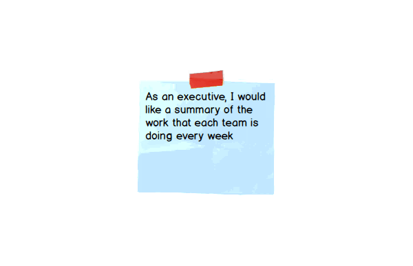
I then wanted to define the desired functionality from the perspective of each user. I wrote them as user stories as this is how they are provided to the build team in Agile processes.


Interactive Low-Fidelity Prototype
With all the feedback I received I made an initial crack at developing a user experience facelift for this in house collaboration and creativity management tool (see below). Here are some key features that address the main user stories:
- Newsfeeds of the most recent designs at various levels including company wide, team wide and project wide
- Comments summary page that displays all comments on various versions of a design in one view so that design decisions from one version to the next can easily be tracked
- Additional context presented for each design including metadata and linking of documents like the functional specification and vision document
- Ability to view the mock-up in full-screen format to see how it appears in the window
Having a database managing the backend will allow comments to be connected to the designs and notification initiation/tracking (possibly through a daily email summary of new comments to the author in regards to their design). However this functionality is in the domain of the build team. A new workflow for adding a design isn’t presented as most users seemed to be happy with the current workflow and wanted to focus on other improvements.
For now, try out this interactive paper prototype!