I just redesigned my portfolio website. The front-end was developed using innovative new web frameworks like Semantic UI, Flexbox, and Sass with Compass. The back-end is WordPress. A methodical process was used from beginning to end starting with defining timelines, brainstorming, creating wireframes, developing a static site designed for web and mobile, WordPress integration, and testing.
Project Management
Managing project goals in an effective manner is essential to finishing it in a timely manner. Therefore I began by identifying some key milestones for my portfolio website redesign and then assigning tentative dates to them. It is good to keep in mind that it can sometimes be difficult to quantify how long it would take you to grasp a new concept (ie. learning WordPress development), therefore making it difficult to meet a deadline. For this reason I managed tasks that were difficult to qualify using a simple Kanban process which I managed in a text editor. I created 3 headings: Todo, In Progress, and Done. With all milestones listed under Todo until I started working on them (moving them to In Progress) and once completed they were placed under Done. It was very gratifying moving tasks to Done and seeing the list grow.
Finding Inspiration
I had been thinking of redesigning my site for few months before I proceeded to do it. I began researching layout ideas and the ones that struck out the most to me were the one-page site (here’s an example) and the infinite scroll (found on Facebook). I really liked these design concepts because they allow site navigation to be simplified. When I actually sat down and began creating sketches I brainstormed without examining other work. This really helped to get the creative juices flowing.
Creating Wireframes
Here are some general functional goals I had in mind when I began sketching out my site:
- Simple navigation
- Making it easy for the site visitor to learn about or contact the site author
- Ability to showcase my portfolio work
- Have a blog integrated into the site
In terms of design I wanted to use large high resolution images to showcase my projects and blog items. I also wanted to draw the attention of the site visitor to the site creator. Therefore the homepage provides details regarding the author, a recent project, a recent blog post, and contact/social media information. Below are some of the initial sketches I created with these goals in mind.
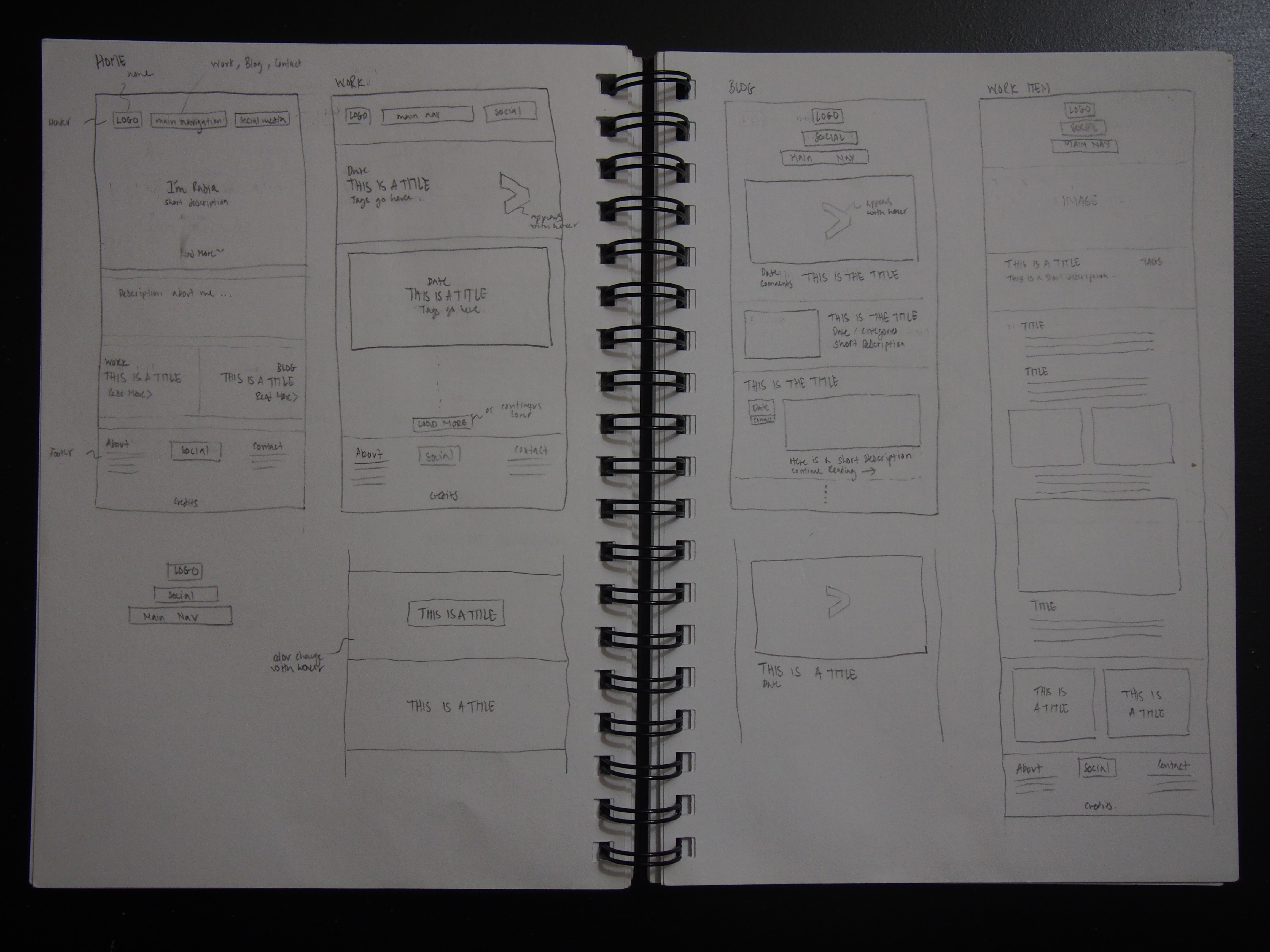
Some initial full page sketches for the homepage, work items and blog.
The one-page site concept is incorporated on the homepage of the site. I added infinite scroll on the work item and blog post list pages so that the number of clicks a user would need to make to see the list of items is minimized.
Designing for Web and Mobile
I began the development of a static site or my site’s front-end on my computer. MAMP was used as my local server. Developing my site locally was helpful as I didn’t need an internet connection and I could easily modify my files in my desired editor. Key pages for my site for which I designed the look and feel for included:
- Home page
- Work list and work item view pages
- Blog list and blog post view pages
- Error or 404 pages
Designing for the web is just as important as designing for mobile today. Therefore a site that looks good in any existing screen size is ideal. Semantic UI allowed me to build a fully responsive front-end for my site. I used Semantic UI’s grid for laying out content and containers to control content width based on screen size. I also made use of media queries for some visual effects based on screen size. For dynamically aligning some of my content I used Flexbox, this particular resource was especially helpful in demonstrating how to use Flexbox for dynamically positioning content. Finally, I used Sass and Compass for cross-browser compatibility. Sass was also very helpful in better organizing my CSS.
WordPress Integration
I’ve had an excellent experience using WordPress as a content management system over the years, therefore I wanted to keep it as my new site’s back-end. In order to change my WordPress site’s look and feel all I needed to do was choose a new theme. The next step for me was to convert the static site I developed into a WordPress theme. In order to begin development I retrieved my live site’s database and set it up locally using MAMP. I developed my theme based on my existing site’s content. These tutorials were very helpful in getting me started with WordPress development.
Testing
Finally I tested my site on various browsers including mobile ones to ensure that my site looks as desired on each one. I identified some known problems with Flexbox as an example on some browsers and resolved it by adding the required prefixes for corresponding CSS elements using Compass.
Finished Product
Here are some mobile screenshots of the finished product! Lets start by taking a look at the homepage. This page was designed keeping in mind the one-page site concept. Slide transitions are used between key sections on the page.

Landing page, click more for further details regarding author.

Scrolling down to recent work and blog items.

Finally scrolling down to contact and social media information.
Here are screenshots from Work. The work and blog list pages have infinite scroll. I added fade transitions between different pages.

List of work items.

Viewing a work item.

Item navigation at the bottom of the work item page.
Here are screenshots from Blog.

List of blog posts.

Viewing a blog post.

Sharing, post navigation, and comments at the bottom of the blog post page.